
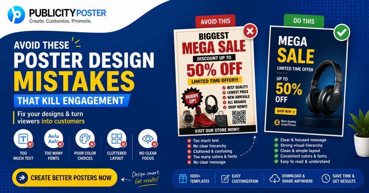
7 Common Poster Design Mistakes to Avoid
Avoid these design mistakes to make your posters more attractive and effective.
Designing a poster might seem simple — pick a background, add some text, throw in a logo, and you're done, right?
Not quite.
Whether you're promoting a sale, announcing an event, or posting on social media, a poorly designed poster can do more harm than good. Instead of attracting attention, it might confuse your audience, get ignored, or worse — make your brand look unprofessional.
But don’t worry — you don’t need to be a design expert to avoid common mistakes.
In this article, we’ll walk you through 7 poster design mistakes you should steer clear of — and share quick tips to help you create posters that look great and actually work.
❌ Mistake #1: Cluttered Layout with Too Much Text
We get it — you want to share every detail. But less is more when it comes to poster design.
Overloading your poster with text can make it:
-
Hard to read
-
Visually overwhelming
-
Easy to ignore
✅ What to do instead:
-
Stick to one key message per poster
-
Use short headlines and bullet points
-
Include only the essential details (e.g. what, when, where)
If you need to share more info, add a QR code or a link.
❌ Mistake #2: Poor Font Choices
Your font speaks for your brand — literally. Using hard-to-read, outdated, or overly decorative fonts can ruin your poster.
Common issues:
-
Using more than 2–3 fonts
-
Mixing styles that don’t match
-
Fonts that are too small or too thin on mobile
✅ What to do instead:
-
Choose clear, modern fonts
-
Use font hierarchy (bold for headings, regular for body)
-
Make sure text is readable at a quick glance
If your audience can't read it in 3 seconds, they’ll scroll past or walk by.
❌ Mistake #3: Low-Quality Images or Graphics
Nothing screams "unprofessional" like a blurry or pixelated image on a poster.
Poor visuals can:
-
Damage your brand credibility
-
Make your poster look outdated
-
Distract from your actual message
✅ What to do instead:
-
Use high-resolution images (preferably 300 DPI for print)
-
Choose visuals that align with your message
-
Use vector icons or illustrations when possible
And yes — always check for copyright when using stock images!
❌ Mistake #4: Ignoring Brand Consistency
If your poster looks completely different from the rest of your marketing — different colors, random fonts, no logo — you're confusing your audience.
Your poster should feel like it's part of your brand family.
✅ What to do instead:
-
Use your brand colors and fonts
-
Include your logo on every poster
-
Maintain a consistent tone (fun, formal, minimal, etc.)
This builds trust and helps people recognize your business instantly.
❌ Mistake #5: Weak or Missing Call-to-Action (CTA)
What’s the point of your poster if people don’t know what to do next?
A poster without a clear CTA is like a road without signs — it leads nowhere.
✅ What to do instead:
-
Add a strong, simple CTA like:
-
“Shop Now”
-
“Call Us”
-
“Visit Our Website”
-
“Order via WhatsApp”
-
-
Make the CTA stand out with a button or bold text
-
Use urgency when needed: “Limited Time Offer”, “Last Day Today”
❌ Mistake #6: Bad Color Combinations
Colors can make or break your poster. If your text blends into the background or the colors clash, people won’t even bother reading it.
✅ What to do instead:
-
Use contrasting colors for text and background
-
Stick to 2–3 main colors to keep it clean
-
Use color psychology to your advantage (e.g., red for urgency, green for eco-friendly)
Tools like Coolors or Canva’s color palette generator can help you create professional combinations fast.
❌ Mistake #7: Wrong Size or Format for the Platform
Designing a poster without considering where it will be used is a common rookie mistake.
If you're using the same design for print, Instagram stories, WhatsApp, and Facebook — it's bound to look weird somewhere.
✅ What to do instead:
-
Design posters in platform-specific sizes:
-
Instagram Story: 1080x1920 px
-
Instagram/Facebook Post: 1080x1080 px
-
WhatsApp Status: 1080x1920 px
-
Print A4: 2480x3508 px
-
-
Use tools like Publicity Poster, which offer downloadable designs in multiple formats
That way, your poster always looks sharp, no matter where it’s seen.
🧠 Bonus Tip: Always Review Before Publishing
Before printing or posting your poster online, take a minute to double-check:
-
Spelling and grammar
-
Image quality
-
Correct dates, contact info, and URLs
-
Alignment and spacing
Better safe than sorry — especially when promoting sales or events!
Design Smart, Not Just Stylish
Poster design isn’t just about making something look good — it’s about communication and conversion. A visually appealing poster that’s also clear, on-brand, and action-driven can dramatically boost your marketing efforts.
Avoiding these 7 common poster mistakes is a great place to start:
-
Don’t overcrowd with text
-
Choose readable fonts
-
Use high-quality visuals
-
Keep your branding consistent
-
Add a clear call-to-action
-
Use smart color combos
-
Design for the right format and platform
✨ Want to Make Better Posters in Less Time?
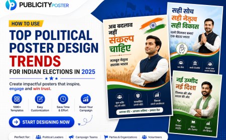
If you’re tired of design headaches, check out Publicity Poster — a platform with daily ready-to-use poster templates for businesses, festivals, sales, events, and more.
No design skills needed. Just choose, customize, and post. 🖼️⚡
What's Your Reaction?
 Like
0
Like
0
 Dislike
0
Dislike
0
 Love
0
Love
0
 Funny
0
Funny
0
 Wow
0
Wow
0
 Sad
0
Sad
0
 Angry
0
Angry
0
Hi, I’m Kalpana 👋 A passionate content writer who loves turning ideas into simple, engaging, and result-driven content. I specialize in creating blog posts, marketing content, and practical guides that help businesses grow and connect with their audience. My focus is always on clarity, value, and writing that actually makes an impact—not just fills space. At Publicity Poster, I write content that helps businesses understand how to promote themselves better, create stunning posters, and grow faster using smart tools. When I’m not writing, I enjoy exploring new ideas, learning about marketing trends, and finding better ways to communicate complex things in simple words. 💡 I believe: Great content is simple, useful, and powerful.


Comments (0)